Asset redesign

Lead product designer · IA + alignment + handoff

  1. 2 yearsBefore restart
  2. 1 weekAligned
  3. 1 monthBeta live
  4. 3 monthsLaunched
Product
UMX – Crypto, US & HK stock trading app (App & Web)
Target users
High-net-worth (HNW) individuals
Scope
Asset tab — the first screen, and the screens behind each tap
Team
1 PM, 5 front-end engineers
How the deadline was set

Before I joined, the app had been in development for 2 years and still wasn’t public. The founder took over the platform, changed the management team, and set a hard deadline: TestFlight beta in 1 month, public launch at 3 months.
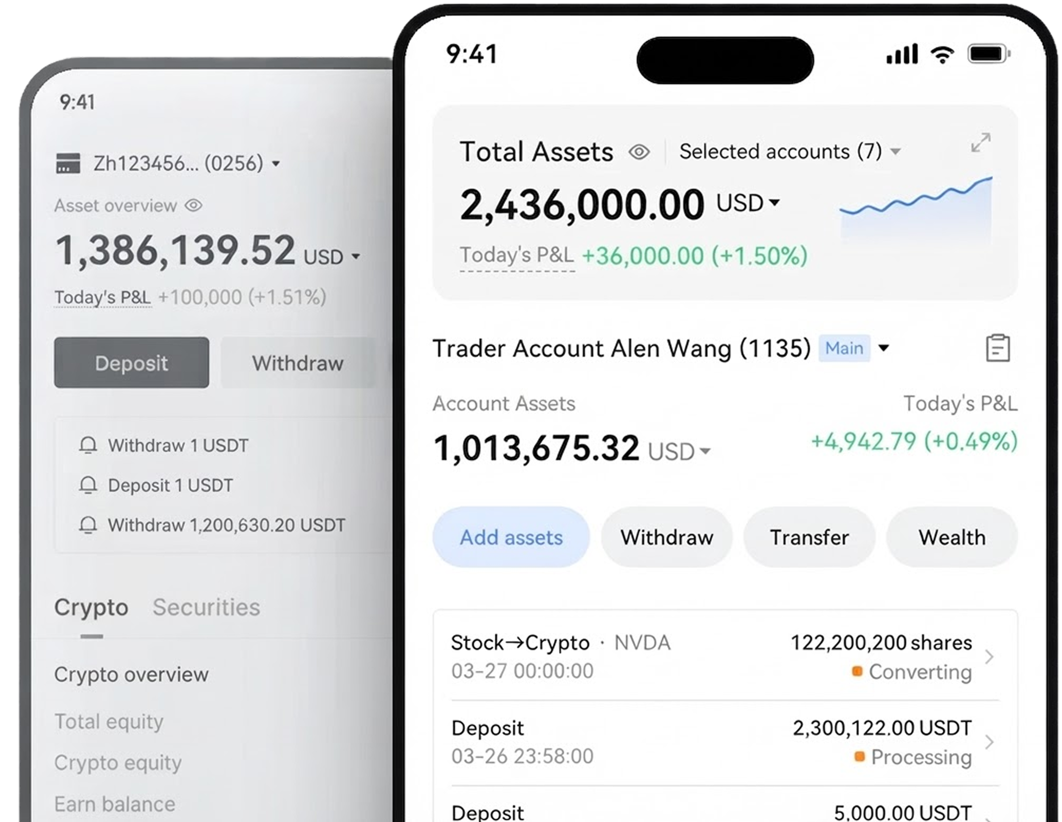
Before and after: the original data-dense asset home behind, the redesigned asset home in front — total assets, account, actions, records, and the crypto panel
Asset redesign
02 · Problem

“Messy” was four structural problems

After management reviewed the existing asset module, I got two comments:

So I started to dig into the problem behind this “messy” feeling.

Asset screen before redesign — crypto tab
1.1 Try it 1.2 2 3 4 4
Hover a number. Tap 1 or 2 to open it.Tap 1 or 2 to try the control. The four problems are below.Tap a number to read its problem.

Scope collision

The top dropdown only filters the total. The one below switches which account’s details you see. They look the same.

A tap can change the wrong thing. Semantic overloading

Crypto ≠ securities

Crypto is a short list. Securities is a dense table. The layout resets on every switch.

People relearn the screen each time they switch asset class. Mismatched mental models

Layout ≠ IA

The screen reads as one flat list. Futures and options actually sit inside the trading account.

People can’t tell where the money lives. Hidden hierarchy

Screen vs real structure
What the screen conveys Portfolio account asset Crypto Securities US Stock Accounts Funding Account Trading Account Coins 4 Crypto Earn My positions 4 Futures Options
What the screen conveys
What the actual IA is Portfolio account asset Crypto Funding Account Balance Fixed-term earn Trading Account Balance Futures Options Auto-earn Positions Crypto Earn Futures Options Securities US Stock
What the actual IA is

Split lists

Coins and My positions are two stacked lists of the same holdings.

People scroll up and down just to see one portfolio. Split attention

03 · The solution

A top-down framework built around the user’s mental model

I restructured the page top to bottom around the user’s mental model: the natural sequence of questions people ask when they check their portfolio. Each layer of the screen answers one question, in that order.

Solves Problem 3 · Layout ≠ IA

  1. “How am I doing overall?”

    Total net worthanchor

  2. “Which workspace am I looking at?”

    Account context switcher

  3. “How is my wealth distributed?”

    Asset class tabsCrypto vs. Securities

  4. “What specific assets do I hold right now?”

    Unified holdings moduleSpot, Futures, Options, Earn

  5. “How close am I to liquidation?”

    Detail on demandIMR / MMR

The three specific fixes

Three component-level fixes put that framework on screen. Each one answers a problem from section 02.

Fix 1

Separate the two account scopes with color

Solves Problem 1 · Scope collision

Before Before: a flat asset screen where the overview dropdown and the account switcher share the same visual pattern
Two look-alike dropdownsThe top one filters totals. The bottom one switches which account’s details you see.
After After: a dark block for the multi-select total, and a light card for the single account switcher 1 2
Two scopes, two surfacesEach control now looks like the scope it changes, so the two no longer read as one.
  • 1 Dark zone: filters the totals and chart.
  • 2 Light card: switches which account’s details you see.

Result: people see what a tap will change before they tap, and always know which account’s details they’re reading.

Fix 2

Align crypto to the securities SDK

Solves Problem 2 · Crypto ≠ securities

What I explored

One scrolling page with stacked crypto and securities sections

I first wireframed one scrolling page that stacked Crypto and Securities. It’s a familiar banking pattern that lets people compare assets in one view.

Explored

Interactive prototype. Scroll inside the phone to try it.

Constraint

Engineering then flagged that Securities runs on a third-party SDK we couldn’t change.

Third-party SDK securities screen we could not edit

What I shipped

Crypto / Securities tabs, aligned to the SDK

Crypto tab after aligning to securities
Crypto tab
Securities tab after
Securities tab
Chose

Align the crypto layout to securities, so both holdings read the same way.

Gave up
  • Seeing crypto and securities together in one view.
  • The crypto-native layout its users already knew.

Fix 3

Merge coins and positions into one module

Solves Problem 4 · Split lists

Before
Asset screen before redesign — crypto tab
Scattered listsCoins and My positions serve the same goal, reviewing assets, so the screen feels cluttered and people scroll back and forth.
After
My positions module after consolidating coins and positions
One My Positions moduleTabs swap Spot, Futures, Options, and Earn in place, so every holding is in one spot.

Horizontal tab switcher

I merged both lists into a single, clean My Positions module, with tabs for Spot, Futures, Options, and Earn.

Mutually exclusive assets

Each holding sits in exactly one of the four, so tabs cut the clutter, end the long scroll, and let people check every holding in one place.

04 · Challenges

Delivering under pressure

Two constraints shaped this redesign: the pace of the reviews, and a market with no pattern to borrow.

01A fast feedback loop

1The constraint

A startup pace, and reviews that kept widening

Leadership set a startup pace for a 100–200 person company: 7 days of back-to-back review rounds, with 2–3 h to rebuild the asset screens each round. Early reviews were open brainstorms. The founder had ideas on every part of the screen, so the discussion kept widening.

2What I did

  • Review only what changed

    The PM and I agreed to walk through only the areas the last review asked to change. Discussion moved from diverging to converging.

  • Start from a familiar baseline

    Tiger Brokers’ established securities patterns gave the team a starting point it could agree on fast.

  • Let AI make the demo data

    AI generated crypto and stock demo data that adds up, so every rebuild went to the layout.

3The proof: a prototype every round

14 May: first asset tab, one blue hero card, a breakdown table and a donut
14 MayHero card, breakdown, donut
16 May: home and asset tabs in one running prototype; dark hero, account, crypto and securities side by side
16 MayCrypto and securities as two cards
17 May: card as selector with share rings; borrow, buying power and margin bars below
17 MayThe card becomes the selector
18 May: action row moves under the hero; an asset-overview panel folds beneath the cards
18 MayActions move under the hero
19 May: a segmented control replaces the cards; one panel with net assets, tiered margin and the two accounts
19 MayA segmented switch replaces cards
20 May: accounts fold into the panel as an expandable distribution
20 MayAccounts fold into the panel. Aligned.
The shipped build today, in English: the same structure with a flatter surface
TodayShipped: same structure, flatter surface

No prototype on 15 May: that day went to a competitor teardown.

Result: by the last round, leadership aligned on the structure that shipped.

What a round of that loop actually changed
Card-as-selector generation: crypto and securities as side-by-side cards with share rings, a black border marking selection12
Gen 1 · the card is the selectorLearned: one card can’t compare, show state, and navigate at once. Selecting and comparing pulled against each other.
Segmented plus panel generation: a full-width net-asset panel with borrow, buying power and MMR, and account cards below123
Gen 2 · segmented control + panelGained: a full-width panel fits the real fields. Still open: the account cards sat below it, so the switch and the numbers it drives looked unconnected.
Current generation: accounts folded into the panel as an expandable distribution that adds up under the headline123
Gen 3 · accounts fold into the panelLanded: accounts become an expandable line under the headline that adds up in front of you — 75,000 + 63,875 = 138,875.
  • 1Where the switch lives — Gen 1 selects by tapping a card; Gen 2 moves it to a segmented control; Gen 3 keeps the control and folds the accounts under the number.
  • 2What the panel holds — Gen 1 stacks rings and bars; Gen 2 fits the real fields; Gen 3 makes the account split an expandable line that adds up to the headline.
  • 3What was outside the panel — Gen 2 dropped the account cards below; Gen 3 brings them inside — and the credit line, added after the review week, sits where borrowing used to.

Three builds of the same decision inside the review week: 16 May → 19 May → 20 May. Gen 3 is the version we aligned on; the frame is captured from today’s build, which is why it carries the credit line added later. Demo data.

02No pattern to borrow

1The constraint

Crypto and stocks as equals, from day one

  • Peers added it laterTiger and Robinhood added crypto, Kraken added US stock RWAs. Each fitted the new asset into its old layout.
  • Both sides hold real moneyUsers split their money evenly, so neither tab could be the secondary one.
  • Two sets of habitsCrypto-natives and stock-natives expect different UI behavior, and the page had to feel familiar to both.
Tiger app: securities portfolio with crypto added later
Tiger · securities first, crypto later
Kraken app: crypto exchange with US stock RWA added later
Kraken · crypto first, US stock RWAs later

How it shaped the screen

  1. 1

    Multi-account, surfaced not buried

    Exchanges usually hide the account switcher in settings. Ours ran several accounts at once, so the switcher sits on the page and drives every figure below it.

  2. 2

    Two pattern languages, one screen

    Crypto apps and brokerages train different conventions, so the shared tabs had to feel familiar from either habit.

  3. 3

    A new product still explaining itself

    Incumbents can stay calm and sparse. A new product has to promote its features too, without sliding back into the clutter we came to fix.

2The strategic trade-off

Prioritize the securities framework

With no peer to copy, I built both tabs on the securities SDK and fitted crypto into its structure. People learn one layout whichever side they come from, and reusing the SDK let us launch on schedule. Fix 2 shows what I explored first

Result: crypto and securities shipped side by side as equals, on the launch date.

05 · Final Delivery

Brand alignment and cross-platform delivery

Once the structure was approved, two things followed: the visual language was aligned to a new brand, and the same hierarchy shipped on the app first, then on the web.

5.1Style iterations

The design system was updated in parallel. The structure stayed, and the surface changed twice.

01Approved

Dark header

The version management signed off: total assets in a dark header.

What I proposed — asset tab with dark header block

02Brand refresh

Light theme

A platform-wide light theme removed the dark header. Hierarchy had to hold without that contrast.

The design we aligned on — light theme after brand and design-director review

03Shipped

Brand details

Before handoff, button styles and corner radii were aligned to the newer brand.

The live build today — final marketing-aligned polish

5.2App first, then web

01App first

Designed and reviewed on mobile

Our founder and management team closely mirrors our target user profile – high-net-worth individuals. Based on their deep market experience, they knew our users would heavily favor mobile app trading, providing critical subject-matter expert (SME) validation for our mobile-first direction.

Because of this, all layout exploration and reviews happened on the app first, and the web version simply inherited the final conclusions.

App prototype · try it here

02Then web

The web inherited the conclusions

No second debate about hierarchy: the same data order, controls, and language. The wide screen only turns “one tap down” into the column on the right.

Web prototype · try it here
Open the page-by-page comparison of the old web and the new — 5 pairs

Overview, crypto tab — before and after

Before Legacy web overview with the crypto tab selected: funding and trading accounts listed as separate rows, no combined number
After The rebuilt web overview with the crypto tab selected: one total, one account with its split, the asset-class switch, and a records column1234
  • 1Total assets — as in the app, one headline number answers “how am I doing?” first.
  • 2Account — one account, one switch, driving every figure below it. The old web had a different switcher on each page.
  • 3Securities / Crypto switch — the same control and the same structure as the app, at a different size.
  • 4Detail on demand — the wide screen turns “one tap down” into “the column on the right.” The order is unchanged.

The same tab, before and after. Left: the legacy build, captured in Chinese. The notes on the right mark the four layers from 01.

Overview, securities tab — before and after

Before Legacy web overview with the securities tab selected: a single cash row, no shared structure with the crypto tab
After The rebuilt web overview with the securities tab selected: the same layout as the crypto tab, different data

Switch to the securities tab and the layout is identical — only the data changes. That is the app-side decision (one structure for both asset classes) arriving on the web.

The other three pages took the same route

Before alignment each of these had its own nav item, its own account switcher and its own risk read. They now hang off the one overview — and all three read the same way: one headline number, one action row, one table.

Fund account

Before Legacy web funding account page, reached through its own nav item
After The rebuilt fund account page: one balance, one action row, one holdings table

Trading account

Before Legacy web trading account page: one dense table listing every coin the system supports, most rows zero
After The rebuilt trading account page: headline balance with borrowed, credit and risk on one line, then the table

Securities account

Before Legacy web securities page with its own account switcher and its own risk label
After The rebuilt securities account page: the same headline-then-detail shape as the crypto pages

Three pairs, each the same page before and after. Left: the legacy build, captured in Chinese. Right: today’s build, at the same scale.

06 · Outcome

Alignment, speed, and room to grow

Week 1

Breaking a two-year deadlock

Management approval

By anchoring the layout changes to proven patterns and clear user mental models, I gave leadership a shared basis to decide. They aligned on the new information hierarchy within a week and approved the redesign for build after two years without a decision.

Month 3

An efficient product launch

From concept to App Store

After the review week, the mobile app and the desktop web dashboards both went live globally in just 3 months, built on the exact layout framework I designed.

Months 4–7

Proving the structure scales

Absorbing a shifting roadmap

The true test of a system is how it handles a changing roadmap. Over the following 4 months, the platform introduced 7 major new fintech and crypto features, requiring zero structural layout changes. Here is where each one landed.

Securities tab
Securities asset screen
USD auto-earn
USD auto-earn screen
Crypto tab
Crypto asset screen
Trading account
Trading account screen

New markets Earning & asset tools Account actions

Hover or tap to highlight on the screens

07 · Retrospective

Retrospective and next steps

What I’d test next

We shipped on a deadline, without upfront user testing. Next, I’d run a before-and-after usability test with 5–8 active crypto and stock traders.

Test 1

5-second test

Can users recall total assets and today’s gain or loss?

Show the main screen for five seconds, cover it, then ask.

Test 2

Timed tasks

How fast can they find it, with no route given?

  1. What do you owe on borrowed crypto?
  2. How much can you still spend on US stocks?
  3. Switch to your second portfolio account.

Record success rate, time, and path.

Try it on the shipped app (A) or a reduced screen (B).

What would change my mind: if users can’t tell which account is active, spacing alone isn’t enough, and I’d give the account card a stronger visual anchor.

Team dynamics: managing collaboration under tight windows

The workflow shift

  • Steady corporate paceThe engineering team was used to small, incremental fixes, like updating a single dropdown.
  • Time for pixel-perfect specsEach change came with plenty of time to spec it down to the pixel.

The handover friction

  • 7 daily review roundsManagement required 7 consecutive daily reviews, so engineering started building as soon as the structure was approved.
  • Framework before polishI handed off the core framework layout before every micro-interaction was polished, which put natural stress on delivery.

The takeaway

  1. Shift the mindsetMoving at this pace takes a mindset shift across teams.
  2. Agree on day oneWhen timelines are compressed, agree up front to ship the core architecture first.
  3. Refine togetherRefine the micro-details together during production, rather than expect a perfect, unchangeable blueprint.
What this case doesn’t show

This project had no room for research or measurement. These two cases cover that half of the practice.