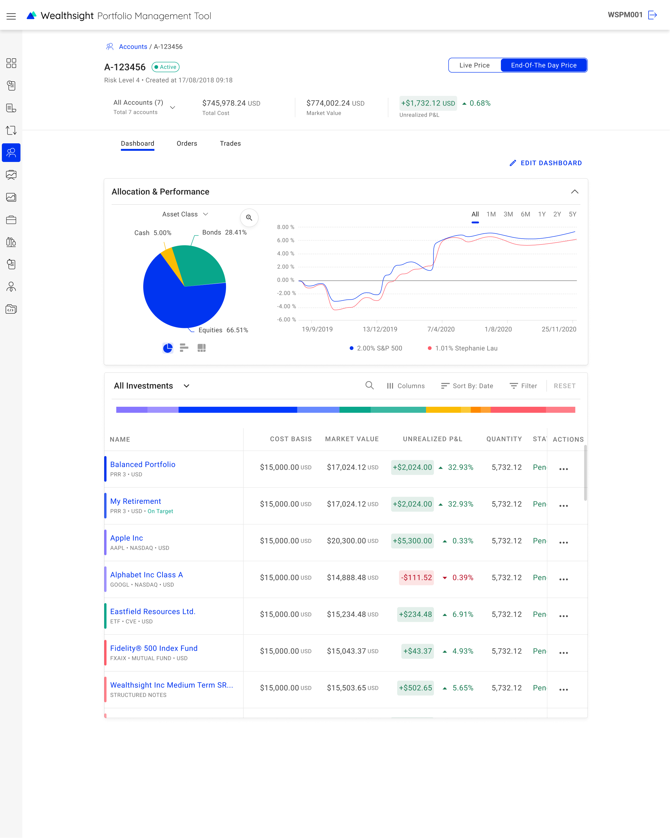
One client-account dashboard, reused across the advisor platform, the individual-investor app, and the portfolio-manager system.02 · Challenges & opportunities
What made a single pattern hard
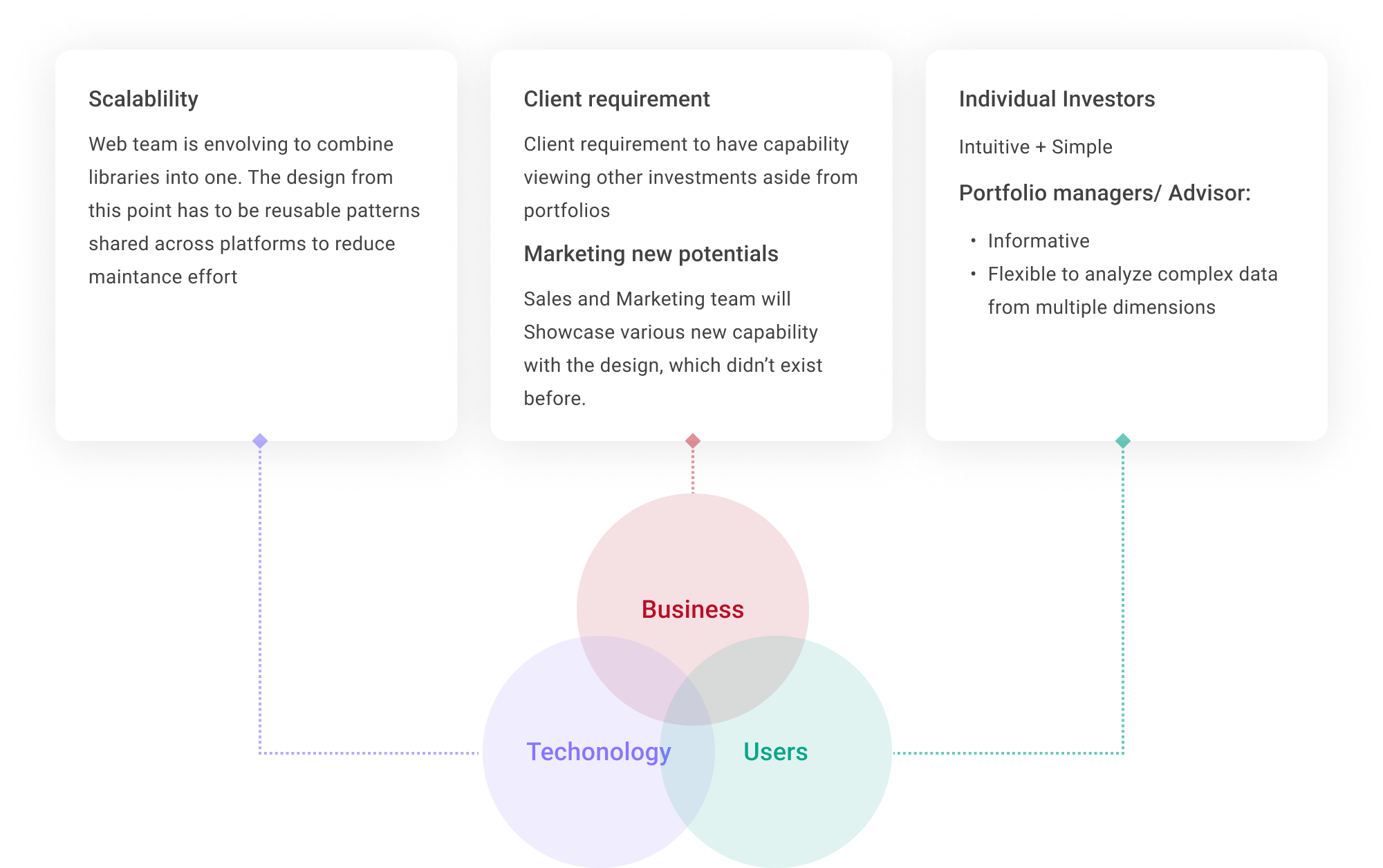
Business, technology, and users pulled the same screen in different directions — scalability, client requirements, and two very different user types.
Incorporate multi-faceted requirements from clients, business value, user experience and technical strategy perspectives. Define a shared design pattern that fit into three different journeys: portfolio management tool, financial advisor and customers.
One pattern for customers & professionals
It is challenging for three designers to agree on one design pattern. Because enterprise users and customers can have totally different goals and focus, this could lead to opposite designs. E.g. to show or hide certain features depends on the frequency of use.
Limited prior research
Because of the timeline to ship the feature to clients — and because some were concepts for a marketing pitch with no existing users asking for them — we had limited knowledge and resources to understand users’ needs and mental models.
03 · Research to design
Translate research findings to design
Audit products: workshop & desktop research
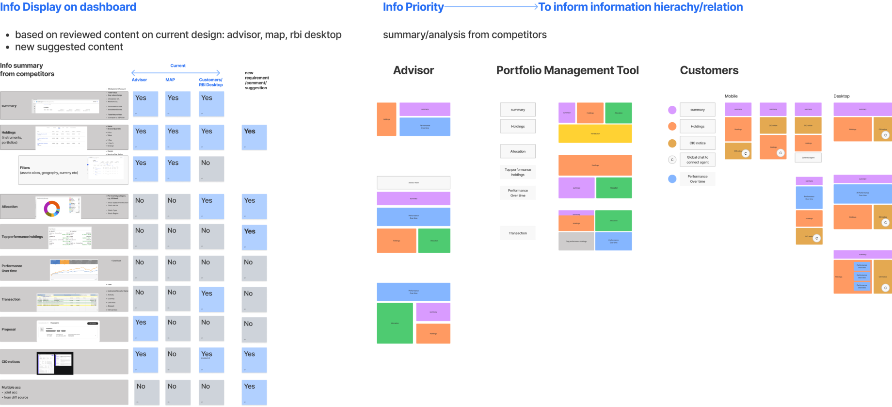
With the design team, I launched desktop research and a workshop to extract the common modules that the customer, advisor and management tools all share. Based on the results, we were able to define what structure and modules to include in the first fold of the screen, and documented the differences between customer and investment-professional tools.
Workshop output: what each tool already showed, then a shared structure for advisor, portfolio-management, and customer surfaces.
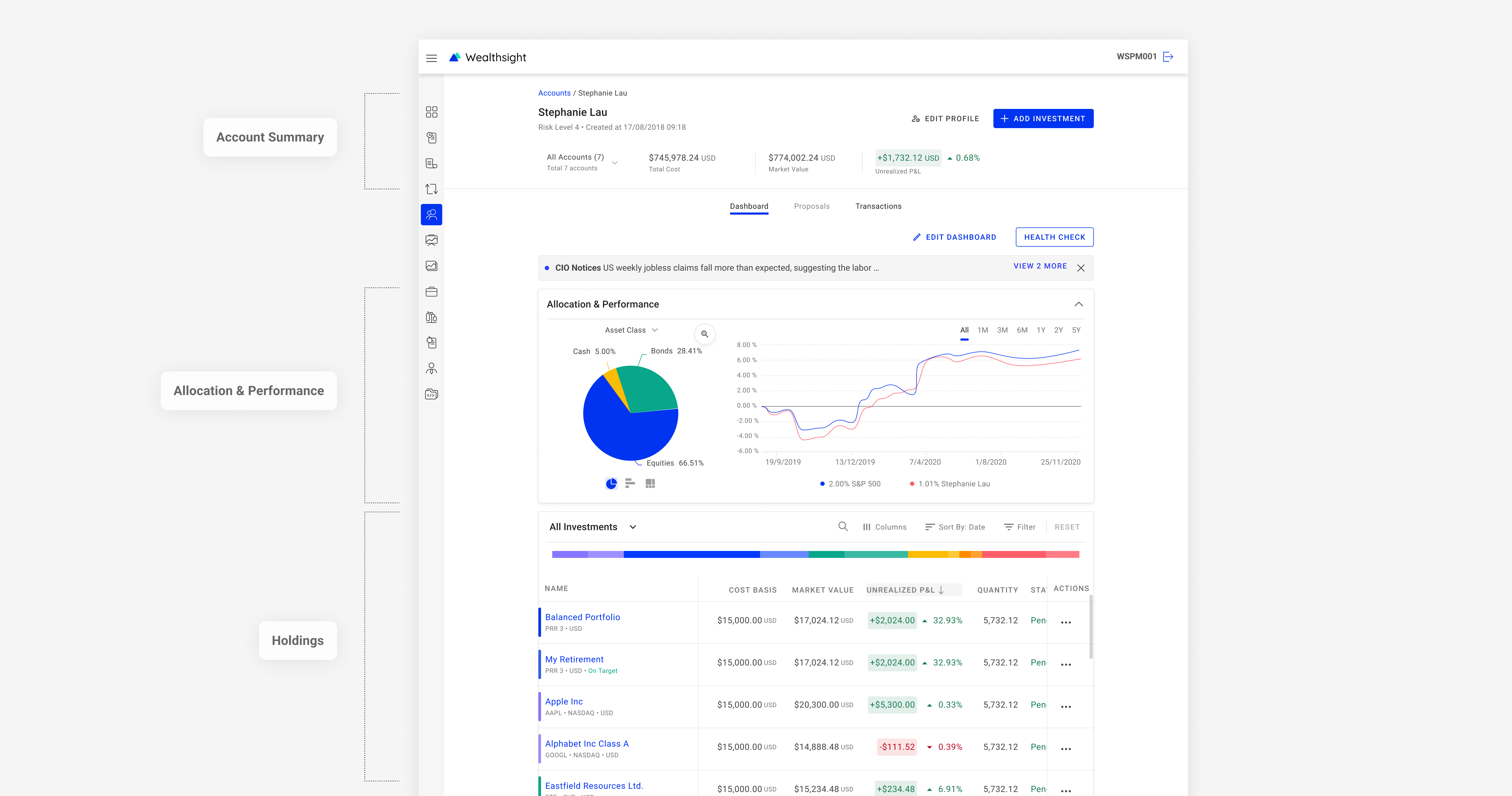
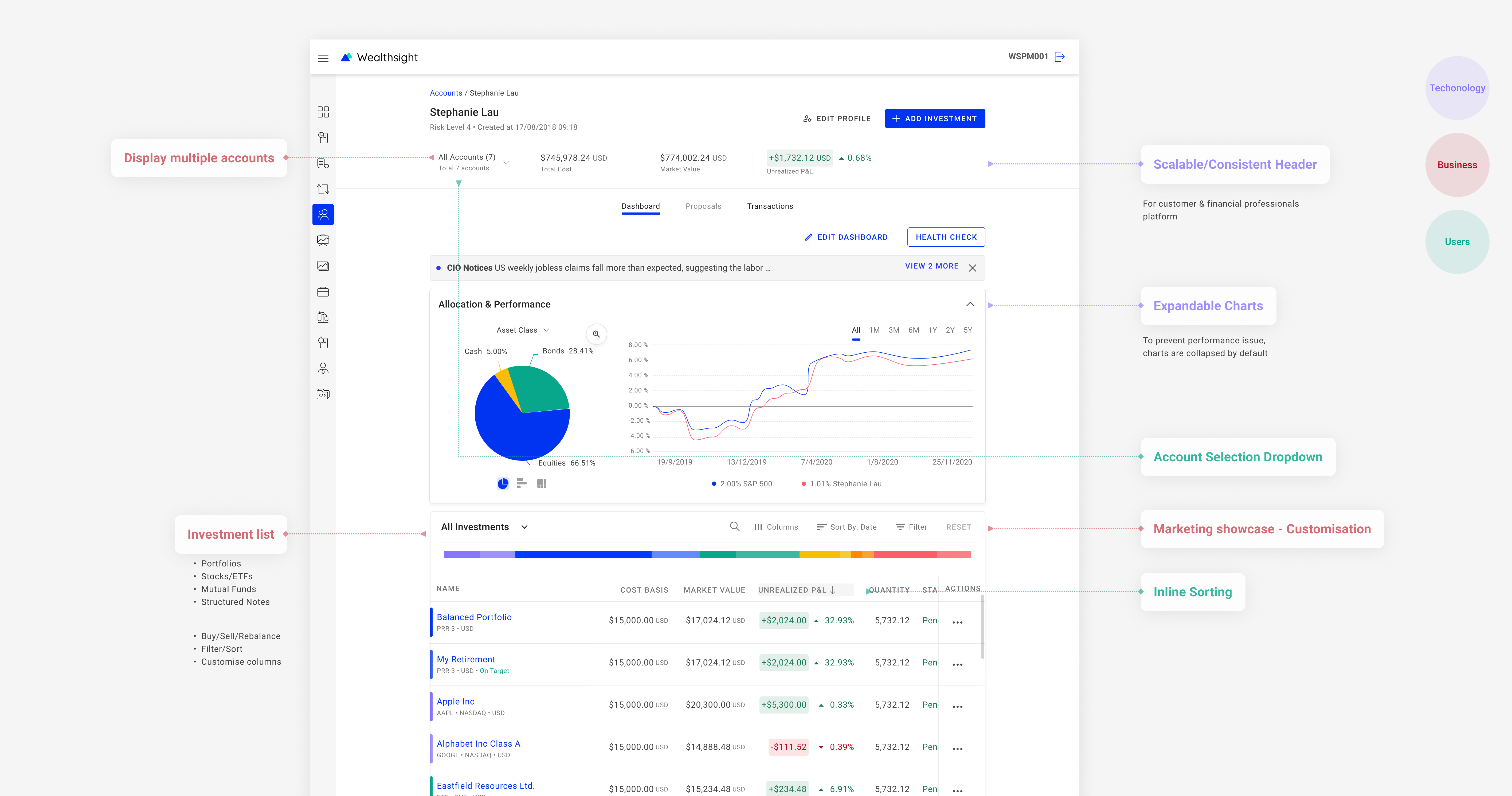
Common pattern: account summary, allocation, performance, investment list
The shared first-fold pattern: account summary, allocation & performance, then the holdings list.04 · Solution & prototype
From concept to a responsive grid
Concept & prototype
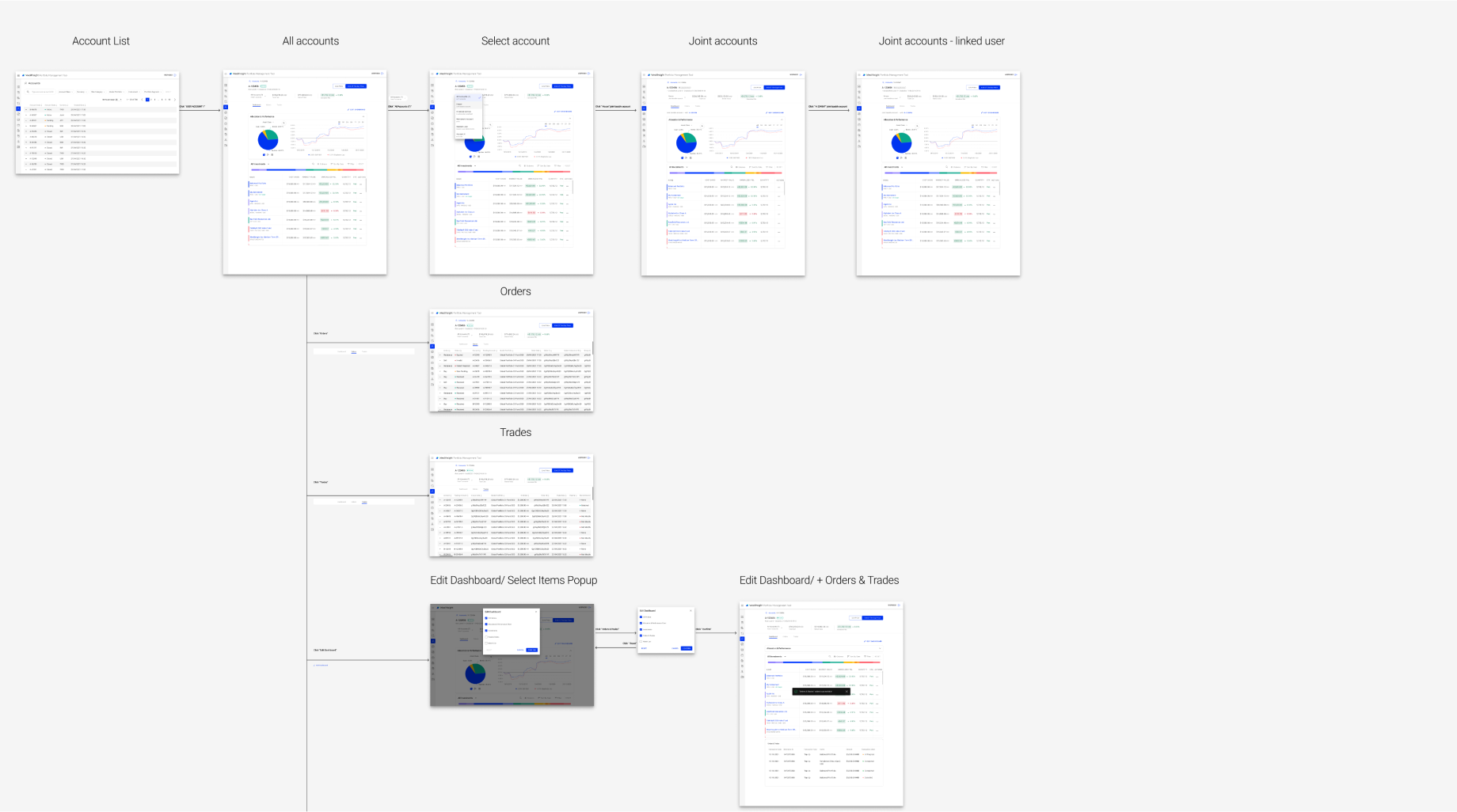
The concept flow we prototyped before locking the visual system.
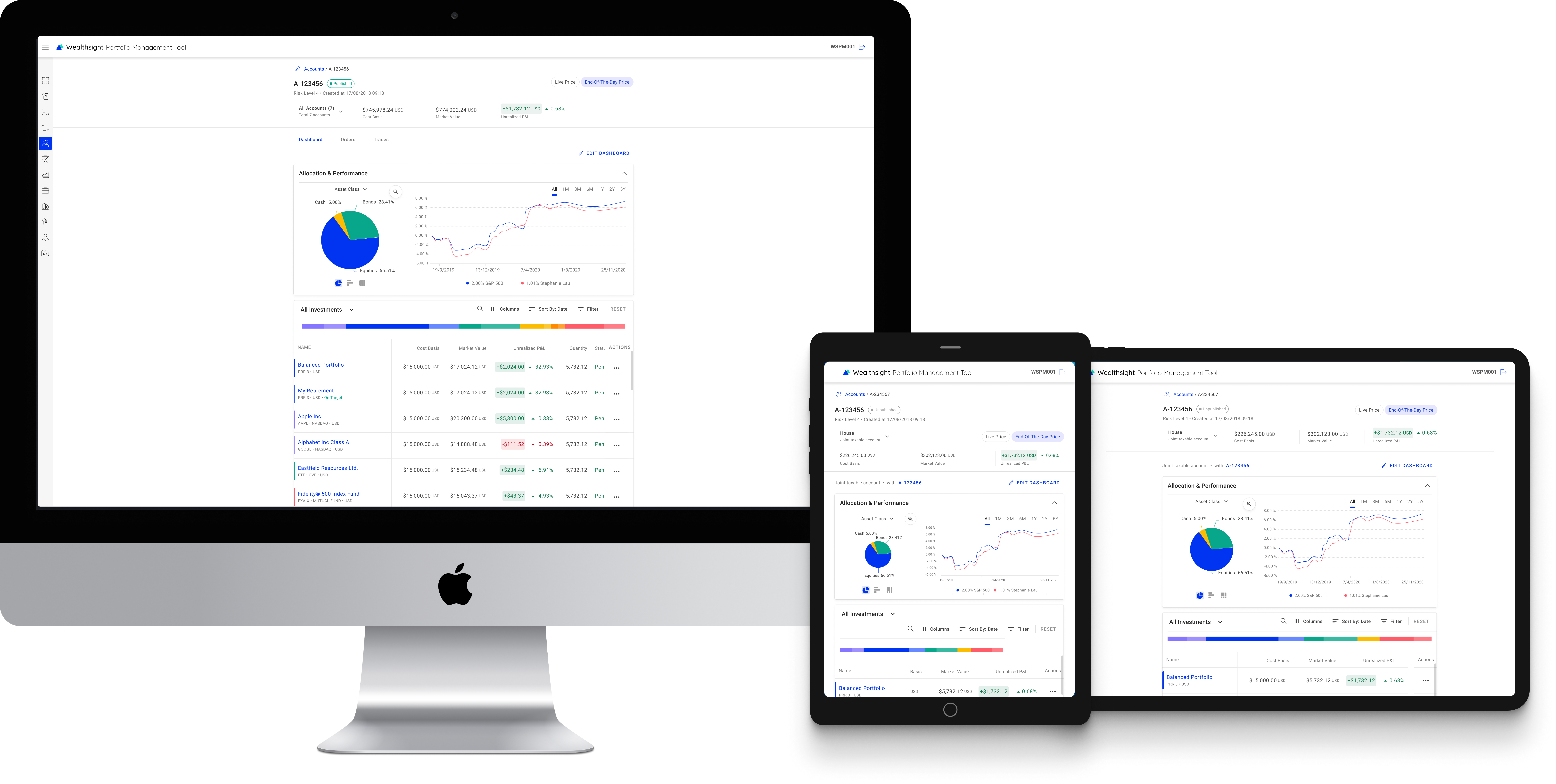
Responsive grid — desktop & tablet
A grid that holds the same modules on desktop and tablet without rewriting the hierarchy.05 · Usability testing
A short cognitive walkthrough
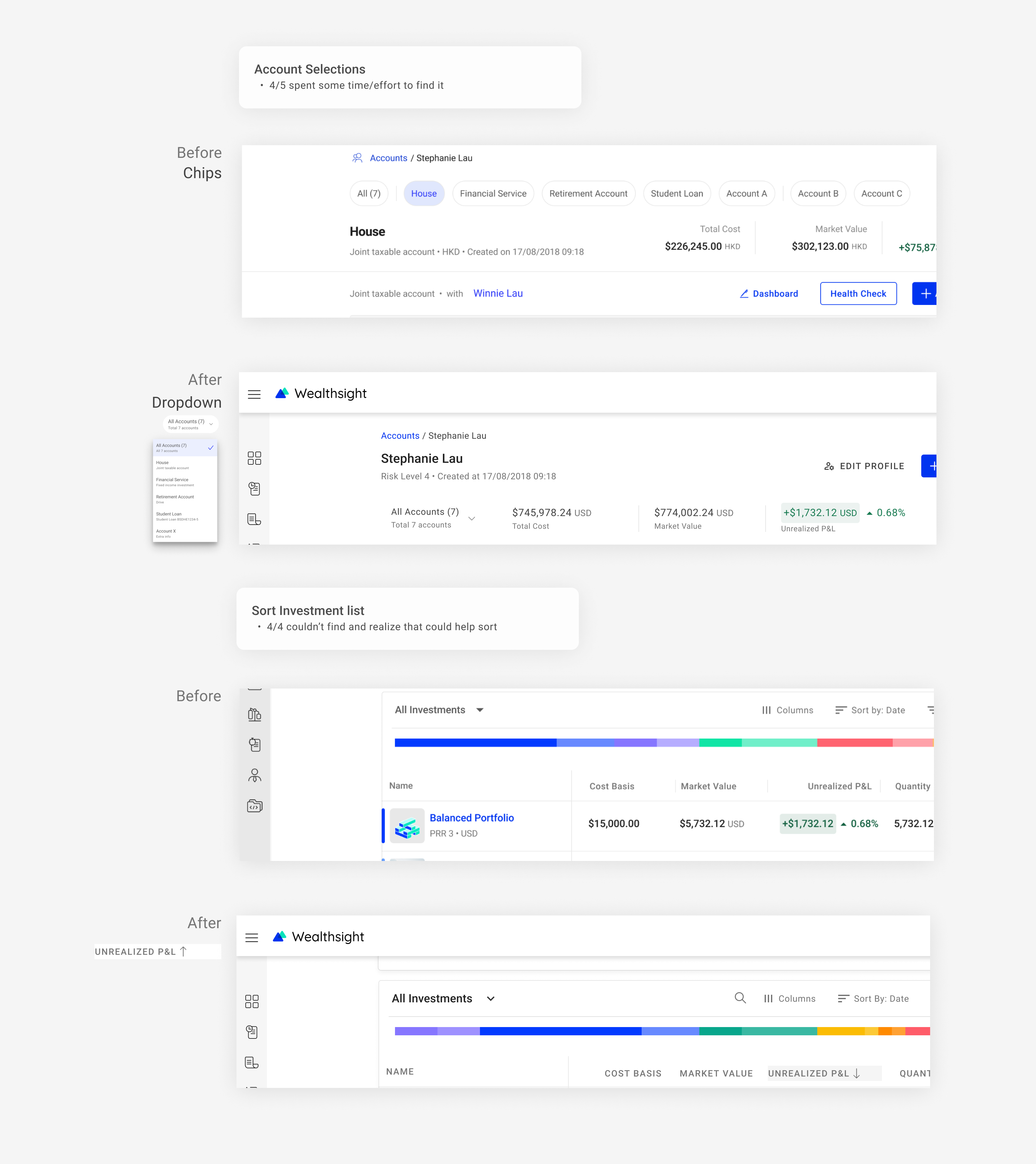
To make sure there were no basic usability problems within a short period of time, I ran a cognitive walkthrough with 5 colleagues to find out how easy it is for users to complete the pre-defined tasks with the concept design.
Findings from the walkthrough — enough to catch basic usability issues before we refined the design.06 · Refined design
The version we took forward
Create concept design and prototypes to validate our ideas.
The refined concept after the walkthrough — still a prototype used to validate the idea, not a visual restyle for its own sake.07 · Constraints & alternatives
What we could not do, and what we did instead
Unable to define use scenarios without thorough analysis of first-hand data at an early stage — what information to include?
Desktop research
Introduced new design patterns, which might be hard to anticipate most technical issues that may need a design update.
Stay open to iteration
Not able to solidly validate the design with real target users.
Cognitive walkthrough
08 · Interactive prototype
Click through the dashboard
Figma prototype of the user-account dashboard. Use the frame to click through the flow.
09 · Future work
Build the advisor tool starting from the dashboard
Create a research plan to inform the product roadmap
To expand the dashboard feature to financial advisors, I proposed a user research plan to better understand advisors’ needs and pain points when managing clients’ portfolios. The research will help us identify key features and functionalities that should be included in the advisor tool.
Phase 2: summarise interview findings into a journey map, persona, and next step